In-Class Activity!


This is what I did for the first activity, We first draw lines from top to bottom and across from left to right, according the the arrangement. We later find out that newspapers is often divided into 4-5 columns and magazines into 2-3 columns, this is due to the size of paper used.
In-Class Activity 2!

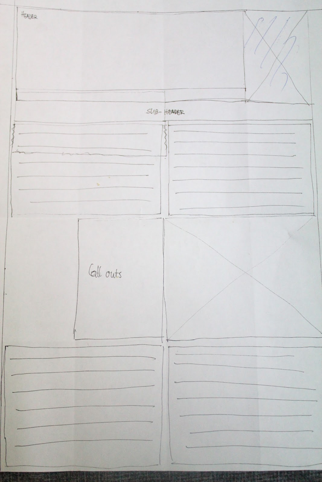
Here is a layout for the magazine. I divided it into 2 columns. This layout was not balanced at first because there is a white space on the left side and not on the right, it's then corrected by removing the image in the upper right hand corner.

This is the grid layout for the poster I did. We find out that most posters have their space taken up by an image (as the background), it also contain header/title and a catchy subheader (rarely contain any descriptions or long narratives ).
Working on:

Have a nice day :D
No comments:
Post a Comment