Monday, November 19, 2012

Last post?

Here are the pictures that are taken in the process of making the last assignment.


This way (above) of making the snowflake is wrong and take lots of time, I changed to the other way of making it (below) which is to draw the complete one.


This is the red-white paper that is used to make the candy cane, it is basically rolled up into shape.


Envelopes!


Sketches!


Sunday, November 4, 2012

Lecture day!


So last 2 weeks' monday, Ms Lisa showed us a bunch of picture if cards. I was curious on what our 8th and last assignment would be, because the slideshow also shows 3D buildings. And.......Yes! making a series of cards which share the same theme. We are given an hour or so to think and come up with a theme and also sketches of them. I literally spent the time thinking  a bunch of ideas instead of focusing on one and develop it. 

In the end, christmas was my theme, but to distinguish it more, I added pop-up. So yeah, pop-up christmas greeting cards. I sketched and came up with my own blueprint of the christmas ornaments, socks, candy cane, snow angel, snowflake and christmas tree. 

Here are the series of 5(not 100% though): 


Assignment 7B (Group project)


Second assignment from the lecture is to be completed by groups.

We started brainstorming all our ideas on how we can show a range of colour tones. 

Here is a picture of the result of our brainstorming: 


We went with our plan 2 in the end. Plan 2 is to make a 3D object that consists of pentagon in each side, we will then colour the sides with different tones of a specific colour. To present it, we used the art of installation, we sticked the pentagons on a wall and glass panel in the drawing room (most stressful part of all!). 

Here is the end result:


Have a nice day :)


Assignment 7A


This assignment is also derived from last lecture, which is colour theory. We are  ask to either hand-draw or digitally produce a picture which consist of colours that goes well with each other, we have warm colours, cool colours, complimentary colours and so on. I chose to use complimentary colours which consist of my 2 favourite colours, green and purple (colours of the aurora :D). I was a little lost on how to make this work. I end up drawing a still-life of a plant and then digitally colour it. 

Here are the end results:


I switched the colour mode to grayscale, which automatically change the colours into different tones of grey.


Colours, Mood & Emotions

Continuing from the last post.

Our assignment for that day was to match a colour to a word and a font style. Basically what the colour represents, and the font that suit with it. Here is the my set of words..


For brown, I used a font that looks like a root branching up from the ground, not noticing that the letter T looks unstable. Pink carries the word passionate from red (which is mixed with white) and the colour also represents feminine, which is why I used a rather feminine font. I used green for my name because it is my favourite colour, and also represents nature.


Red represents courage, and the font I chose looks strong and heavy, in my opinion it goes well with the colour. 'Calmness' is one of the word that the colour blue represents and I chose a less edgy font to go with the flow of the word. Purple represents royalty, and I used a  cursive font because its mostly found in royalties.


For grey, I chose a more edgy-tight font to go with the word depression because people who suffer from depression are usually stressed with so many things running through their mind. Horror is one of the emotion that black represents. The words 'Keep Calm' was taken from the viral poster in the internet, the font itself is calm, and also white which compliments it very well.

Have a nice day :)

Colour Theory

Apologies for the late post :D

So our 7th lecture was about colour theory, there are bunch of colours out there. Although before everything that looks blue is blue/light blue to me, but after this lecture I found out there are actually different kinds of names for different tones of blues. I find this lecture very interesting indeed. Colours are divided into levels. Primary colours are basically your yellow, red and blue. Secondary colours are the result of 2 primary colours mixed together, these colours are purple, orange and green. Tertiary colours are the results of mixing a primary colour and secondary that are beside each other, for example, yellow + orange = yellow-orange.

Each colour has its own partner(is it the right word?). Colours that are beside each other are called analogous colours.
Colours that are opposite each other are called complimentary colours.


Every colour also represents emotions and moods. Which leads to our next assignment....


Monday, October 1, 2012

Composition! (Brochure)


Alrighty, another in-class activity, this time making a brochure. We are asked to accomplish this task in pairs, I paired up with Zachary. We first choose which type/colour of paper we want to use, which we chose black. Then, time to hunt for brochures and magazines for pictures, text and whatever is extractable from them. Taylor's Design School booklet was our main focus, we made a brochure out of it. We cut out pieces of textures, text and pictures from it.

Here is the final product,


This is the main content of our brochure, we took the background texture and then cut it into a polygon to add a variation.


This is the outer page of our brochure, we tried to keep the colour of the textures, text and images to be either dark-ish red, blue or yellow, which is our colour theme.

Progress pictures are coming up! 

Have a nice day! :)

Monday, September 24, 2012

Composition Assignment

Assignment 5

Another composition assignment, a more fun one :). 

Paper Cut Out!

Our blade/knife handling skills are tested in this assignment. We are asked to create 2 A4 paper cut out  and mount it on an A3 mounting board. 1 should represent balance & symmetry and another one to represent dominance, space & weight. 

Idea 1-

Plants!pLants!plAnts!plaNts!planTs!plantS!

yeah! plants, for the dominance, space & weight, I mainly focus on leaves. *googles "leaves"*. So, from the search I made, maple leave stands out the most, that is one, the rest are basically greens. 

Idea 2

I thought of making a symmetrical flower, but it didn't look nice so I started looking for another one. Heart shape is another one, threw the idea away though. I stopped and have a break on this assignment. I was playing poker on facebook and suddenly an idea pops up, why not align all the symbols (since it is symmetrical). And there goes the draft.

Here is a time lapse video of the process. Enjoy :) 

Assignment 4!!

Assignment 4

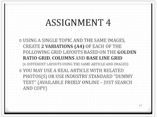
We are asked to create 2 variations of 3 different grid layouts, baseline grip, column grip and golden ration grid. I started off re-reading the presentation again to get a better picture of what i'm suppose to do. After reading, I decided to look for an article, end up using an article about iPhone 5 that I copied from a website**.

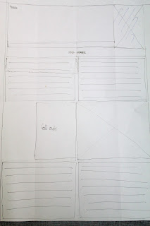
Drafting the layouts-

 Baseline
 Baseline
 Golden Ratio
Columns

These are the drafts I made, some changes are made throughout the process though.

Mounted!

These are the pictures of the mounted output

Columns (I added another column for the grid on the right side)
 Golden Ratio
Baseline

Thats all for assignment 4

Note: Essay about understanding grids is included in the previous post :)

**http://www.wptv.com/dpp/news/national/iphone-5-release-date-aapl-upgrade-how-to-check-if-youre-eligible-for-iphone-5-special-pricing 

Friday, September 14, 2012

Class Activity, Grid System!

      Today, we learnt different types of grid systems which are used in various layouts such as prints and websites. Grids are essential in designing a layout, it determines the balance and consistency of the content. The better the content is arranged, the easier for the reader to receive information of what the advertising is trying to say. Creating hierarchy in a layout is also important, it helps classify things according to its important. Headings have largest font, sub-headings have the second largest (usually bold/italic), and the main body content may have fonts ranging from 8-11pts. 

In-Class Activity!


This is what I did for the first activity, We first draw lines from top to bottom and across from left to right, according the the arrangement. We later find out that newspapers is often divided into 4-5 columns and magazines into 2-3 columns, this is due to the size of paper used. 

In-Class Activity 2!


Here is a layout for the magazine. I divided it into 2 columns. This layout was not balanced at first because there is a white space on the left side and not on the right, it's then corrected by removing the image in the upper right hand corner.


This is the grid layout for the  poster I did. We find out that most posters have their space taken up by an image (as the background), it also contain header/title and a catchy subheader (rarely contain any descriptions or long narratives ).


Working on:


Have a nice day :D